 Author
 |
Topic: Black and white silhouette pieces (Read 7791 times) |
|
Janzert
Forum Guru
    

Arimaa player #247
Gender: 
Posts: 1016
|
 |
Black and white silhouette pieces
« on: Dec 1st, 2008, 1:22pm » |
 Quote Quote  Modify Modify
|
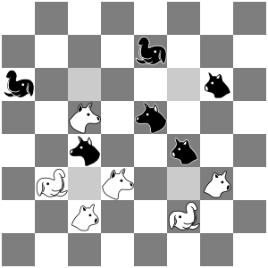
I've been wanting a set of black and white pieces for a while. I've even tried creating some once or twice before but they've turned out pretty horrible. The other night I decided to give it another try again and see if I could come up with anything better.
My primary goals are fairly clean, simple pieces that will stay easily recognizable at small sizes.
I used inkscape and started with a traced sillouette from the current piece graphic. I just did the elephant, dog and cat to see how they would look. They still aren't very good but I think I'm getting closer to usable with this iteration at least.

Just wondering what other people think and if anyone else has made any alternate piece graphics.
Janzert
|
| « Last Edit: Dec 1st, 2008, 1:25pm by Janzert » |
 IP Logged IP Logged |
|
|
|
The_Jeh
Forum Guru
    

Arimaa player #634
Gender: 
Posts: 460
|
 |
Re: Black and white silhouette pieces
« Reply #1 on: Dec 1st, 2008, 2:47pm » |
 Quote Quote  Modify Modify
|
They look nice. Maybe add a few whiskers to the cats so they aren't so similar to the dogs.
|
|
 IP Logged IP Logged |
|
|
|
BlackKnight
Forum Guru
    

Arimaa player #695
Gender: 
Posts: 98
|
 |
Re: Black and white silhouette pieces
« Reply #2 on: Dec 1st, 2008, 4:30pm » |
 Quote Quote  Modify Modify
|
Very nice, Janzert!
Maybe we could also create a LaTeX font based on your graphics?!
|
|
 IP Logged IP Logged |
|
|
|
Fritzlein
Forum Guru
    

Arimaa player #706

Gender: 
Posts: 5928
|
 |
Re: Black and white silhouette pieces
« Reply #3 on: Dec 1st, 2008, 4:53pm » |
 Quote Quote  Modify Modify
|
Tachyon also made some images:

I don't think it makes sense to have a checkerboard, because there are no diagonally-moving pieces in Arimaa, as there are in chess and checkers.
I agree with The_Jeh that whiskers on the cat are a must.
I wonder whether the dog should look more wolf-like, another way of distinguishing it from the cat.
|
|
 IP Logged IP Logged |

|
|
|
Fritzlein
Forum Guru
    

Arimaa player #706

Gender: 
Posts: 5928
|
 |
Re: Black and white silhouette pieces
« Reply #4 on: Dec 1st, 2008, 4:56pm » |
 Quote Quote  Modify Modify
|
Omar also put up some images:
http://arimaa.com/arimaa/graphics/bw/
I don't think shading within the black and white pieces will work very well, though. At a small scale it makes the pieces look fussy. I expect what we are after is very simple, very stylized images.
|
|
 IP Logged IP Logged |

|
|
|
Janzert
Forum Guru
    

Arimaa player #247
Gender: 
Posts: 1016
|
 |
Re: Black and white silhouette pieces
« Reply #5 on: Dec 1st, 2008, 6:33pm » |
 Quote Quote  Modify Modify
|
Yeah, the way the cat turned out is my least favorite. I tried some whiskers but couldn't get them to work well and they tend to disappear when the piece is scaled down. I think the overall shape needs to change more to help make it distinct from the dog.
Of all the ones I've seen now I think I like Tachyon's the best so far.
Janzert
|
|
 IP Logged IP Logged |
|
|
|
arimaa_master
Forum Guru
    

Arimaa player #2010
Gender: 
Posts: 358
|
 |
Re: Black and white silhouette pieces
« Reply #6 on: Dec 2nd, 2008, 4:22am » |
 Quote Quote  Modify Modify
|
on Dec 1st, 2008, 6:33pm, Janzert wrote:Yeah, the way the cat turned out is my least favorite. I tried some whiskers but couldn't get them to work well and they tend to disappear when the piece is scaled down. I think the overall shape needs to change more to help make it distinct from the dog.
Of all the ones I've seen now I think I like Tachyon's the best so far.
Janzert |
|
I like shapes:
Elephant - Janzert
other peaces - Tachyon
but I think that a little close-cut of cats would be even more distinguishable from dogs.
|
|
 IP Logged IP Logged |
|
|
|
omar
Forum Guru
    

Arimaa player #2
Gender: 
Posts: 1003
|
 |
Re: Black and white silhouette pieces
« Reply #7 on: Dec 3rd, 2008, 6:59am » |
 Quote Quote  Modify Modify
|
Wow, I had no idea others were working on this. Karl mentioned to me in the chat room that he was looking for black and white pieces, so I just used photo shop to generate black and white images from the colored images. When they are large, it looks pretty good, but for small images it does get a bit fuzzy.
I also think Tachyon's looks the best so far.
|
|
 IP Logged IP Logged |
|
|
|
aaaa
Forum Guru
    

Arimaa player #958
Posts: 768
|
 |
Re: Black and white silhouette pieces
« Reply #8 on: Dec 3rd, 2008, 7:09am » |
 Quote Quote  Modify Modify
|
The black dogs of Tachyon are a bit pig-like.
|
|
 IP Logged IP Logged |
|
|
|
BlackKnight
Forum Guru
    

Arimaa player #695
Gender: 
Posts: 98
|
 |
Re: Black and white silhouette pieces
« Reply #9 on: Dec 6th, 2008, 8:23pm » |
 Quote Quote  Modify Modify
|
I used the coordinates of the Arimaa Dog to design a dog character using METAFONT.

It can be scaled easily, and it could be used in diagrams or within the text for example.
|
|
 IP Logged IP Logged |
|
|
|
Tachyon
Forum Guru
    

Arimaa player #3433
Gender: 
Posts: 66
|
 |
Re: Black and white silhouette pieces
« Reply #10 on: Dec 7th, 2008, 2:26am » |
 Quote Quote  Modify Modify
|
Ok I have completed a revised set of the Arimaa board images. Here it is

Comments ? ....
|
| « Last Edit: Dec 7th, 2008, 2:29am by Tachyon » |
 IP Logged IP Logged |
|
|
|
Tachyon
Forum Guru
    

Arimaa player #3433
Gender: 
Posts: 66
|
 |
Re: Black and white silhouette pieces
« Reply #11 on: Dec 7th, 2008, 3:54am » |
 Quote Quote  Modify Modify
|
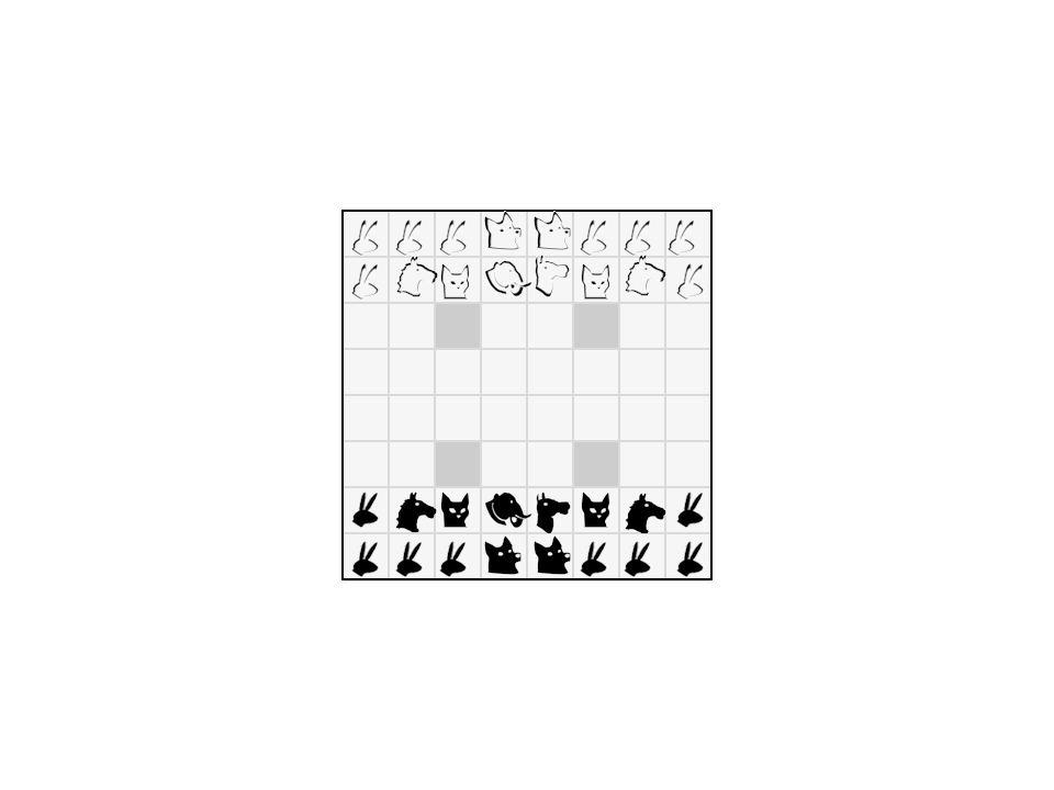
I have used the latest design as the basis for an Arimaa font.
This is a board done in MS Word

Using the Arimaa font and Keys as follows :

|
| « Last Edit: Dec 7th, 2008, 3:55am by Tachyon » |
 IP Logged IP Logged |
|
|
|
Fritzlein
Forum Guru
    

Arimaa player #706

Gender: 
Posts: 5928
|
 |
Re: Black and white silhouette pieces
« Reply #12 on: Dec 7th, 2008, 6:51am » |
 Quote Quote  Modify Modify
|
This is fantastic, Tachyon. I like the new dog much better; it is not only clearly recognizable as a dog, it is clearly distinguishable from all the other pieces. I also like how whiskers make the cat more recognizable.
The current set is close enough to what I was hoping for that I am starting to think about how it will look printed in a book, as opposed to on a computer screen. I'm a little worried that gray might not print as smoothly on paper as it appears on the screen, but I don't really know if that is true with modern printing technology. I wonder who would know. The reason I'm concerned is that the current white pieces look much better on a gray background than on a white background, so either the printing of gray needs to be good, so we should consider further thickening the outline of the white pieces.
One minor point that strikes me is that the cat head is the biggest image of the bunch. It's more noticeable now that the dog has shrunk. Ideally image size would be a cue as to piece strength, in addition to our pre-existing knowledge that elephants are big and cats are small.
Also, I see that you are using capital letters for the dark pieces and small letters for the light pieces. I think of silver and gold as both being light colors, i.e. neither color is a natural match for being dark, but for black-and-white printing one of them has to be dark. I propose that we standardize on silver being dark, not because silver is any darker than gold, but because that will correspond to the intuition of chess players that white goes first, and the white pieces are at the bottom of the board, and that white is playing up the board. Also if the obsolete notation of 1w, 1b, etc. pops up anywhere, it will be handy if we have associated Gold with the white pieces as well as with the capital letters. We can choose any conventions we want, of course, but since Omar already started us down the path of gold=white=first move=bottom of board=capital letters, we might as well fall in line rather than bucking that trend.
As a final small point, I like how the Arimaa client reflects the silver pieces from the gold on a vertical axis. This gives us another point of distinction and easy reference without having to do any extra graphic design. I think it would be a nice touch to have that reflection in the board diagrams and in the font.
Thanks again for creating and sharing these fine piece images!
|
| « Last Edit: Dec 7th, 2008, 6:58am by Fritzlein » |
 IP Logged IP Logged |

|
|
|
aaaa
Forum Guru
    

Arimaa player #958
Posts: 768
|
 |
Re: Black and white silhouette pieces
« Reply #13 on: Dec 7th, 2008, 7:15am » |
 Quote Quote  Modify Modify
|
The whiskers on the cats look a bit weird. Perhaps make them longer and less triangular.
|
|
 IP Logged IP Logged |
|
|
|
Tachyon
Forum Guru
    

Arimaa player #3433
Gender: 
Posts: 66
|
 |
Re: Black and white silhouette pieces
« Reply #14 on: Dec 7th, 2008, 9:10am » |
 Quote Quote  Modify Modify
|
Quote: I'm a little worried that gray might not print as smoothly on paper as it appears on the screen ...
|
|
I know that print is a science in its own right and not one that I am an expert at. The font has really been designed for printing and I can only judge by the results I get on my own little HP Printer. The font used in a printed document looks quite good (I think). Ideally we should elicit advice from a printing service at this point.
Quote:... we should consider further thickening the outline of the white pieces.
|
|
Have you tried to print the word doc ? What does the print look like ? If you still think the outline should be thicker, this is easily done by using bold on the white pieces.
Quote:| ... cat head is the biggest image of the bunch ... |
|
Sure ... I could refine the image sizes accordingly.
Quote:| ... gold=white=first move=bottom of board=capital letters ... |
|
OK ... If I understand correctly you would prefer to have the Capital letters used for the black font and small letters for white ? ... I could do this quite easily.
Quote:| ... Arimaa client reflects the silver pieces from the gold on a vertical axis ... |
|
Huh ? ... Sorry ... I do not understand this statement ... I have never seen any reflection 
|
| « Last Edit: Dec 7th, 2008, 9:22am by Tachyon » |
 IP Logged IP Logged |
|
|
|
|